Pretty on Purpose: The Hidden Psychology Behind Japanese Candy Packaging
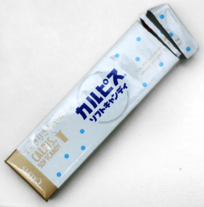
Photo: Richard Masoner, CC BY-SA 2.0, via Wikimedia Commons
You've been there. You're scrolling through an online shop, minding your own business, when a box of Japanese candy stops you cold. Maybe it's a pastel illustration of a cartoon rabbit holding a strawberry. Maybe it's a matte-finish tin with gold foil lettering that looks like it belongs in an art museum. Either way, your wallet is already nervous.
This is not an accident.
Tokyo's candy industry has quietly become one of the most sophisticated packaging design ecosystems on the planet, and Western consumers are only just starting to realize they've been lovingly manipulated. The good news? The candy inside almost always lives up to the hype. The better news? Understanding why the packaging works makes the whole experience even more fun.
The Art of First Impressions (And Second, And Third)
In Japan, the concept of tatemae — presenting the best possible version of something to the outside world — runs deep in everyday culture. Applied to candy packaging, this philosophy means that even a 100-yen bag of gummies gets the same deliberate design attention you'd expect from a luxury brand.
American candy packaging tends to prioritize loudness: bold fonts, neon colors, flavor callouts in 72-point type. Japanese packaging operates on a completely different frequency. Think quieter color palettes, intricate illustrations, and typography that functions more like calligraphy than a billboard. The result is packaging that feels considered rather than shouted at you — and that subtlety is exactly what makes Western consumers stop scrolling.
Design researchers call this the "aesthetic-usability effect": when something looks beautiful, people automatically assume it works better and tastes better, even before they've tried it. Japanese candy brands have been exploiting this cognitive shortcut for decades without ever needing to name it.
Collectibility as a Business Model
Here's where things get really clever. A huge portion of Japan's candy market is built around collectible packaging — seasonal artwork, regional exclusives, character collaborations, and limited-edition runs that rotate fast enough to create genuine scarcity anxiety.
KitKat Japan is probably the most famous example internationally, with over 300 regional flavors, each packaged with local imagery designed to make them feel like edible souvenirs. But walk into any Tokyo convenience store and you'll find the same logic applied to everything from gummy bears to rice crackers. The packaging isn't just a container — it's a reason to buy again next month when the design changes.
For American collectors and snack enthusiasts, this model is almost unfairly effective. We're already primed by decades of trading cards, sneaker drops, and Funko Pops to understand and crave limited-edition culture. Japanese candy packaging slots right into that psychology, except now the payoff is also delicious.
The Unboxing Factor
Social media didn't create Japan's obsession with presentation, but it sure did reward it. The Japanese tradition of furoshiki (careful, beautiful wrapping) predates Instagram by centuries, but the platform transformed it into a global marketing engine.
Japanese candy brands — whether intentionally or not — design packaging that is almost algorithmically optimized for unboxing content. Layers of wrapping. Inner trays. Individual piece wrappers with their own tiny illustrations. The reveal is built into the product architecture, giving content creators a natural narrative arc that practically films itself.
A box of Meiji's chocolate assortment or a Royce' potato chip chocolate tin doesn't just taste good — it performs well on camera. And when that content goes viral among American food communities on TikTok or YouTube, the packaging becomes the product's most powerful advertisement.
Minimalism as a Luxury Signal
There's a specific subset of Japanese candy packaging that deserves its own analysis: the deliberately minimal, almost aggressively restrained designs that communicate premium quality through absence rather than abundance.
Think of Shiroi Koibito's clean blue-and-white cookie tins from Hokkaido, or the understated elegance of Toraya's yokan boxes. These designs speak a visual language that American consumers increasingly associate with high-end products — think Apple, or Aesop skincare. The message is: we're so confident in what's inside that we don't need to scream at you.
For US consumers who've grown up in a visual landscape of aggressive marketing, this restraint reads as sophistication. It signals that you've found something real, something that doesn't need to try too hard. That feeling — of discovery, of being in on a secret — is enormously powerful purchasing motivation.
Why This Works on Americans Specifically
American snack culture has spent the last decade in a full-blown identity crisis. Between the clean-eating movement, the nostalgia economy, and the explosion of "foodie" identity, US consumers are simultaneously craving novelty and authenticity. Japanese candy packaging delivers both at once.
The unfamiliar characters and kanji text signal exotic novelty. The craftsmanship and obvious care signal authenticity. And the social media virality creates a community of fellow discoverers — which is, ultimately, what a lot of modern consumption is really about. You're not just buying candy. You're buying membership in a taste community that knows something most people don't.
At Candy Tokyo, we've seen this play out in our own community constantly. Customers who come for one viral product stay because the whole aesthetic ecosystem — the packaging, the presentation, the seasonal rotation — keeps delivering that same hit of discovery.
The Wrapper Is Part of the Flavor
Here's the most interesting thing about all of this: the packaging psychology isn't separate from the candy experience — it's genuinely part of it. Research in sensory science consistently shows that presentation affects perceived taste. Wine in a heavier bottle tastes better to most people. Chocolate from an elegant box tastes richer than the same chocolate from a plastic bag.
Japanese candy makers seem to understand this intuitively. The care they put into packaging primes your expectations, and your brain does the rest. By the time the candy actually hits your tongue, you're already halfway to loving it.
So the next time a beautiful Japanese candy package stops your scroll and quietly empties your wallet, just know: you're not weak. You're responding to some of the most thoughtfully engineered desire-creation on earth. The least you can do is enjoy the candy.